
The other day I got this email from Topps shilling some of their “Collectible Posters” and there was a series that featured logo artwork by an artist named Timothy Raines… and no, he doesn’t appear to be related to former Expo Tim Raines.
The Collectible Posters featured Raines’ artwork based on MLB team logos and (because it’s Topps) the 1978 Topps Baseball design. I went and checked it out, and it seems very nice and well executed, but none of it “spoke to me”.
I noticed a poster for the Rockies, and my initial thought was “Isn’t that interesting, the Rockies didn’t exist in 1978 and here they have the Rockies wordmark in the 1978 style.”

…And then the possibilities of this set in, and I said “Oh, that is interesting….”
One thing you have to understand is that 1978 Topps is one of those sets that people shy away from when it comes time to make Archives sets or custom cards. The bulk of the design is extremely simple, but the main stumbling point is that script team name. One can’t just download a font to duplicate it.
One thing I’d played with in the past was trying to piece together letters and sequences of letters and even pieces of letters to fake up one of the five teams that didn’t exist in 1978… Here’s a quickie example for “Nationals”:

I’d done one experiment with this method in the past, as a prelude to making a still-in-the-works “card from another universe” featuring the fictional “1978 Seattle Pilots”:
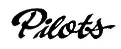
Faking this script can be somewhat time consuming, but not impossible… and I believe that this is the technique Topps used when they created new wordmarks for the Rockies, Rays, D-Backs and Nationals.
So anyway, the whole gist of this is that I took the images of those Collectible Posters, isolated the wordmarks for the newer teams, added a white ‘border around it (disregard the green part, that’s just a remnant from my methods and I forgot to remove it)….

And voila, a word mark ready for customs like this one:

(Not happy with the font used for the player name & position, but I’ll play with that when I get time.)
After I made this custom, I decided that I could improve on Topps work… I don’t think they properly adjusted the size of the “o” to match the other letters, so I tweaked it a bit after I made the Zimmerman custom. Here’s the Topps version again:
…and here’s my tweaked version (as it stands right now).
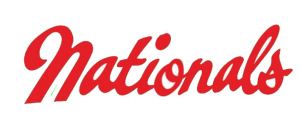
I broke the word into “Nati”, “o” and “nals”, squished the “o” and leaned it over slightly, and then pushed them all together again. I think it looks better, but there are still a couple of things that I wold improve upon.
BTW, when Topps created their capital “N”, I think they used the “M” from Mariners instead of from Mets… and I think the narrower letter works better for a long name like Nationals.
Here are the other wordmarks I isolated from the Topps posters:
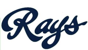
Rays is probably the easiest of the bunch. “R” from Reds, Rangers or Royals, “ays” from Blue Jays. Voila.
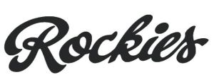
“Rockies” is a little tricky… One can use the “Ro” from Royals, the “k” from Yankees, the “ies” from Phillies, but none of the teams circa 1978 have a lower-case “c” in their names. I don’t particularly like this “c”, it looks kind of kludgy. I think I’d tweak it before I used it.

Topps cheats a bit by using the “D-Backs” nickname rather than “Diamondbacks”… But it saved them from fabricating a lowercase “m”, and it probably looks better abbreviated, anyway. They did a better job on this “c” than the one in Rockies.
Some of you may have noticed a missing team – there’s no Marlins. I went to the Timothy Raines website and he did do the Marlins logo, but for some reason Topps is not selling a Collectible Poster of that team… those bastards! (Just kidding guys, I love you, you know that).
I hope I didn’t bore anybody too much, but I thought the “custom people” would appreciate the information, and the rest of you would get a glimpse into the terrible obsession that haunts us customizers.
