Those of you who were with me last off-season are familiar with the “Hot Stove” custom set which I used to feature offseason trades, signings, uniform changes, manager hirings and the like. It also gives me an opportunity to play around with my graphics software and see how well I can “photoshop” players into their new uniforms. Here’s one of last year’s cards:

That design was based on the 1960-62 Bazooka set, a simple, yet appealing set which I’ve grown fond of over the past few years. …And yet, I still don’t have any. Those little suckers are hard to find! OK, to be fair, it’s ones that are selling for a price I’m willing and able to pay that are hard to find.
For the upcoming Hot Stove design I wanted to replicate a different vintage oddball set, and I considered a number of designs, most notably 1970 Kellogg’s (even though I wouldn’t be able to replicate the “3-D” part). I ultimately decided to go with 1959 Bazooka… another Bazooka set I don’t have any cards from, and one that is considerably more budget-busting than the 1960-62 cards.
THE ORIGINAL 1959 Bazooka SET
1959 Bazooka is an unnumbered, blank-backed 23 card set with 14 short prints; Nine cards were originally issued, with 14 more being added later. Here’s an image I borrowed from another website:

Each card made up the entire back of a 25-count box of Bazooka gum, and they’re fairly large cards, measuring just under 3” X 5”. Since buying a box of 25 pieces of Bazooka was a a significant up-front investment for a kid, these cards were relatively scarce to begin with, and that scarcity naturally hasn’t improved over time. Just as a quick example, the cheapest one I could find in the “Sold” listings of eBay was a non-short-printed Jim Davenport which went for $14. Another example of their relative scarcity: There isn’t a single 1959 Bazooka baseball card listed for sale on COMC.
Late in 1959, an 18 card football set with the same design was issued. Those cards are similarly hard to come by.
THE CUSTOM SET
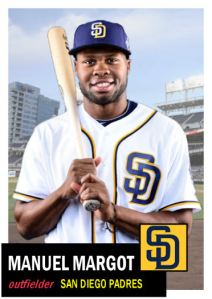
Here’s the first “Promo card” for 2013/14 Hot Stove:

By the way, this custom is not so much a prediction as it is a theoretical possibility which nicely illustrates some of the points of this post. As they say when odds and point spreads are involved, this is “for entertainment purposes only”. Matt Garza will be a free agent after the season, but I’m not aware of any interest or disinterest on the part of the Diamondbacks.
Of course, if Garza does sign with the D-backs, you heard it here first!
Fair warning
The rest of this post goes into details about what I was trying to do and how I went about doing it. This may not be everybody’s cup of tea, but I wanted to write it anyway. I will not take personal offense from anyone skipping the rest of this post…
…but if you do skip the rest of the text, at least scroll down a bit to look at the other “promo card”.
Also, if you have any suggestions, constructive criticism or the like, please feel free to let me know in the comments.
REPLICATING THE CARD DESIGN
The original cards are considerably taller than my custom… but those dimensions are hard to work with in terms of cropping photos to fit properly, so I made the dimensions more conventional. Like last year’s Hot Stove set, these customs are slightly taller and slightly narrower than standard size.
I naturally tried to match the fonts, colors, and such as much as possible.
One thing I noticed about 1959 Bazooka is that the two lines of text are justified so that they begin and end at roughly the same spot on the card… but the way it’s done is different on the two lines.
When adjusting for longer and shorter player names, in addition to making the font slightly wider or narrower, they adjusted the space between the letters. If you look at the originals above, you’ll notice that “DUKE SNIDER” has slightly more space between letters than “ORLANDO CEPEDA” does.
However, the second line with the team name and player’s position was handled differently… On that line, there is some very minor adjustment to the spacing between letters, but they did most of their ‘adjusting’ by adding or removing space between the position and team.
To allow for space, Topps would sometimes abbreviate the city in somewhat odd ways… “DET. TIGERS”, “SAN FRAN. GIANTS”, “PHILA. PHILLIES”. Topps did this in other sets at the time, and I really like that little detail, so I’m going to try to work those in to the customs.
Like the 1960-1962 Bazooka set, the 1959 set uses a variety of colors in the bottom of the card, and the colors have no relationship to the team pictured. I’ve noticed that the football cards used some color combinations that weren’t used for baseball, and I’ll be using combos from both sets.
MODIFYING LOGOS OF MODERN TEAMS
The original cards have team logos, but at the time – I would presume because of the limitations of the printing process used – the logos were slightly simplified in both details and colors. I gave brief thought to using logos from 1959, but then I’d be outta luck when I needed to create a custom for any of the teams which didn’t exist in 1959.
So what I did instead was take a current logos and tried to put myself in the shoes of a 1959 Topps artist by following these two rules:
- Make it as if I were going to print these with 1959 technology
- Make it as if I were going to sell these to kids.
When there were multiple current logos to work with, I went with the one which was most “kid friendly”. For example, with the Red Sox I went with the “pair of socks” sleeve logo rather than the “B” cap logo.
I also took each logo and simplified it as much as I could. If a color fell outside of the “Topps color pallet”, I changed it to something that was Topps-like. I also eliminated shading, drop shadows and other 21st century detail. Here’s an example of what I did with the Diamondbacks’ logo:

If I felt the logo needed a box around it, I did so; otherwise, I added a colored border around the logo to help it stand out against the colored background.
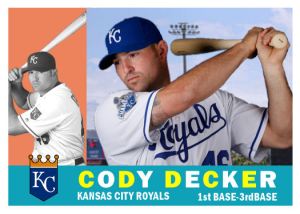
Here’s the second promo card:

Again, this custom is here mainly to illustrate some points. Unlike Garza, I have read of a very tenuous connection between Arroyo and the Mets, along the lines of “The Mets are one of several teams which may be interested in Arroyo”.
BTW, this attempt to change Arroyo’s Reds uniform into a Mets uniform is far from my best work, but I’m a bit out of practice and I didn’t want to spend too much time on an image that could very well look comical in 6 months’ time.
If you compare the names “MATT GARZA” and “BRONSON ARROYO” in the two promos, you get a good example of what I was talking about above. Both cards are using the same font in the same size, but Garza’s name is spaced out more in order to make up space.
So that’s what you’ll be seeing over the winter…
If teams behave themselves and hold their major announcements until after the World Series, like they’re supposed to, you’ll be seeing these go live in late October or November.
In the meantime, if you have any suggestions, please don’t hesitate to leave a comment. I’m not 100% satisfied with what I’ve got, so there are at least a couple of minor changes I’m going to make. I’d be more than willing to consider any constructive criticism you might have.